
Guest Post by Vrushank Setty
Key ideas discussed
As we have discussed the basic terminologies of what Fixed Income instruments are in the previous post, lets dive deeper and understand the following concepts in this post:
- What is a Yield Curve?
- What are the common shapes a Yield Curve can take on?
What is a Yield Curve?
A Yield Curve is a graphical representation of the different values of yield (interest rates) across different period of time (i.e. maturities of the bond) for comparable bonds.
The vertical axis represents yield and the horizontal axis represents time to maturity for a particular bond. Yield Curves are also used as benchmarks to compare other rates such as mortgage rates and bank lending rates. The Yield Curve plays a pivotal role in indicating a country’s economic well-being.

Generally, government bonds are utilised to construct yield curves, because:
- They are available for a wide range of maturities
- They don’t introduce additional complexity as in the case of corporate bonds
You can find the common US yield curve rates at the website referenced here (link).
Common Shapes of Yield Curves
1) Upward sloping Yield Curve (Normal Yield Curve)
An upward sloping yield curve indicates, yield on the long term bond is greater than the yield on the short-term bond. This implies that the market has favourable expectations about the economy in the near-term and hence demands lower rates in the short term (signs of economic expansion).
In an environment where market participants expect the interest rates to rise in the long-term, it becomes very risky for investors to have their investments tied up in longer-term bonds as they are expected to fall in price. Therefore, the demand increases for short term bonds, as there is greater market certainty in the near term. This pushes their yields even lower (remember, the bond yield and bond price follow an inverse relationship?). This causes the yield curve to look like the image below:

2) Downward sloping yield curve (Inverted Curve)
The increasing demand for long term maturity bonds and the lack of demand for short-term maturity bonds, leads to lower yields on long-term bonds and higher yields on short-term maturity bonds. This causes the shape of the yield curve to invert. Again, remember that the bond prices and yield follow an inverse relationship, higher the yield, lower the price and vice versa. So a higher short-term yield (lower demand, lower price) indicates that the market is uncertain about the near-term economic scenario and hence the demand for long-term maturity bonds increases, which consequently leads to the long-term yield to go down (higher demand, higher price). The shape here indicates the yield from the long-term bond will continue to fall and shows signs of a possible economic recession in the near term (approx 12-18 months).

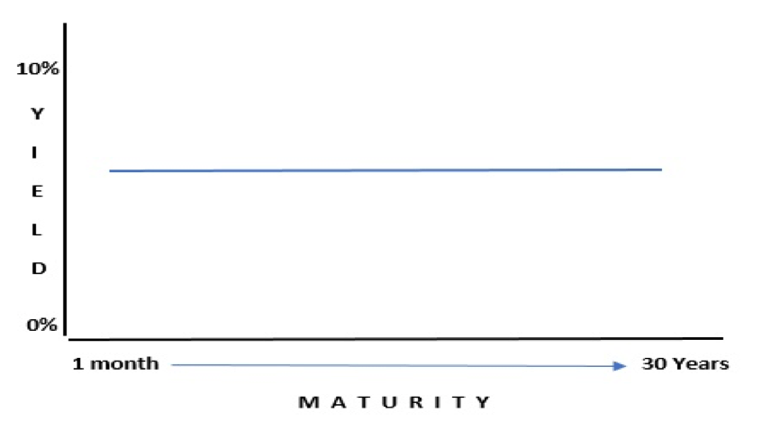
3) Flat Yield Curve
This usually occurs during the transitionary period between economic expansion to economic recession or vice versa.
That was a brief description of what the “Yield Curve” is all about and the different shapes it takes in commensuration with the economic scenario. In the next post, we will look at the the different theories proposed in financial literature about Yield Curves.
